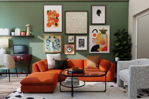
The Dos and Don’ts of Colour Palettes in Interior Design
When embarking on an interior design project, one of the most pivotal decisions a designer makes is selecting a color palette. The right color scheme can dramatically transform a space, injecting it with personality and warmth. In contrast, poor color choices can lead to a disjointed feeling that makes a room feel uncomfortable or uninviting.
- The Dos and Don’ts of Colour Palettes in Interior Design
- Importance of Color Palettes in Interior Design
- Common Mistakes to Avoid
- Dos of Choosing Color Palettes
- Understand the Psychology of Colors
- Use Color Theory to Create Harmony
- Don'ts of Color Palettes in Interior Design
- Avoid Using Too Many Colors
- Steer Clear of Clashing Colors
- How to Implement Neutral Color Palettes
- Adding Texture and Layers
- Accenting with Pops of Color
- Dos and Don'ts of Mixing Different Color Palettes
- Tips for Successfully Mixing Colors
- Mistakes to Avoid When Combining Color Palettes
Importance of Color Palettes in Interior Design
Color palettes serve as the foundation for interior design, guiding decisions about furniture, textiles, and even the layout of a room. They evoke emotions and influence perception, making their role undeniably significant. Here are a few reasons why color palettes are essential:
- Mood Creation: Different colors can evoke different feelings. For example, blues can instill calmness, while reds can invigorate energy.
- Spatial Awareness: Lighter colors can make a room feel larger and more open, whereas darker tones can create a cozy, intimate atmosphere.
- Cohesion and Flow: A well-thought-out color scheme ties various elements in a space together, creating a sense of harmony that can guide the eye effortlessly from one area to another.
Consider a recent kitchen renovation where the homeowner opted for a soft green palette. Not only did it give an earthy feel, but combined with natural wood accents, the colors breathed life into the space, making it perfect for family gatherings.
Common Mistakes to Avoid
While colors can enhance a home, there are also common pitfalls to be mindful of. Avoiding these mistakes can make a significant difference in achieving your desired result:
- Ignoring Lighting: Natural and artificial light can drastically change how colors appear in a room. Always test paint samples in your space before committing.
- Lack of Balance: Overwhelming a room with too many bold colors can create visual chaos. Aim for a balanced mix of accents and neutral tones.
- Following Trends Blindly: Trends come and go; personal style should be the priority.
By recognizing the importance of color palettes and steering clear of frequent mistakes, anyone can create a living space that feels authentically them. With careful thought and consideration, the world of interior design becomes a canvas waiting to be filled with color and creativity.
Dos of Choosing Color Palettes
Once the foundational understanding of color palettes has been established, it’s time to delve into the actionable aspects of choosing the right colors for your space. By focusing on psychological factors and color theory, you can create a harmonious environment that enhances well-being and style.
Understand the Psychology of Colors
Colors have a profound impact on our emotions and behaviors. By grasping the psychology of colors, you can make informed choices that align with the desired atmosphere of your space. Here’s a quick breakdown of some common colors and their psychological effects:
- Red: Energetic and attention-grabbing, perfect for stimulating conversation.
- Blue: Calming and serene, making it ideal for bedrooms or relaxation spaces.
- Yellow: Cheerful and uplifting; a great choice for kitchens or playrooms.
- Green: Restorative and nature-inspired; excellent for living areas and offices.
- Purple: Luxurious and creative; works well in artistic or personal spaces.
In a recent project, a client wanted to create a tranquil home office. By incorporating shades of blue and green, they transformed the space into a soothing environment that boosted productivity.
Use Color Theory to Create Harmony
Color theory is the backbone of effective design, guiding how colors interact with one another. Utilizing color wheel principles can lead to beautiful, cohesive palettes. Here are some key concepts:
- Complementary Colors: Colors opposite each other on the wheel, like blue and orange, create a vibrant contrast.
- Analogous Colors: Colors next to each other, such as blue, green, and teal, provide a calming effect and harmonious vibes.
- Triadic Colors: A set of three colors evenly spaced on the color wheel, such as red, blue, and yellow, can create a lively, dynamic look.
Mixing these approaches means you can achieve a balanced space that captivates the eye. For example, using analogous colors in a living room with soothing greens, soft blues, and hints of teal can create an inviting, cohesive atmosphere perfect for lounging or entertaining. By understanding color psychology and leveraging color theory, you can make informed and thoughtful decisions that lead to spaces that resonate deeply with their inhabitants.
Don’ts of Color Palettes in Interior Design
Armed with the dos of choosing color palettes, it’s equally essential to recognize what to avoid. Certain missteps can turn the well-intentioned design vision into a chaotic or uncomfortable space. Let’s delve into the common color pitfalls to steer clear of.
Avoid Using Too Many Colors
While it can be tempting to use a rainbow of colors in an effort to bring vibrance and life into a space, this approach can quickly lead to visual clutter. Striking a balance is key. Here are some insights on managing color variety:
- Rule of Three: Aim to limit your palette to three main colors: a dominant color, a secondary color, and an accent color. This keeps the design coherent and focused.
- Neutral Grounding: Use neutrals as a base to tie various colors together. Shades like beige, gray, or white can provide breathing room amidst bolder colors.
- Consistent Accents: If you want to incorporate more colors, use them in smaller, consistent doses across the space, like accessories, cushions, or art.
For instance, in an exuberant living room remodel, a homeowner initially chose six different hues. Upon further reflection, they chose to focus on navy as the primary color paired with soft gold and muted coral accents. The result? A sophisticated yet lively ambiance without overwhelming the senses.
Steer Clear of Clashing Colors
Clashing colors can create a jarring effect that detracts from the intended style of the space. Different tones and shades need to complement each other rather than compete. Here are some practical tips:
- Warm vs. Cool: Be mindful when mixing warm and cool colors. For example, pairing a bright yellow with a cold violet can be disorienting.
- Test Combinations: Always try out color combinations in the home’s lighting before finalizing decisions. What looks great on a color wheel may not translate well in the room.
- Use Color Theory: Familiarize yourself with complementary and analogous colors to ensure the shades work harmoniously together.
When a savvy designer attempted to combine bright orange and electric blue in a dining area, the intended cheerful vibe turned into a dissonant visual clash. A reconsideration, opting for a warm coral and a soft ocean blue instead, created a much more inviting and cohesive dining atmosphere. By avoiding these essential pitfalls, homeowners can create beautiful, harmonious interiors that express their personal style without overwhelming or clashing. Remember: simplicity and cohesion often lead to the most stunning outcomes in interior design!
How to Implement Neutral Color Palettes
Neutral color palettes are often celebrated for their versatility and timeless appeal. They create a serene canvas that can adapt to changing tastes and trends, making it easier to refresh a space with minimal effort. However, many may wonder how to make these muted tones feel inviting rather than bland. Let’s explore two effective strategies: adding texture and layers, and incorporating pops of color.
Adding Texture and Layers
One of the most effective ways to elevate a neutral palette is by introducing various textures and layering elements. Texture adds depth and visual interest, preventing a flat appearance despite the limited color scheme. Here’s how to do it:
- Materials Matter: Mix different materials such as wood, metal, and fabric. For instance, a wooden coffee table alongside metal side tables can create a dynamic balance.
- Textiles: Use textiles of differing weaves, such as a chunky knit throw, silk cushions, or a jute rug, to add cozy layers. This not only enhances comfort but also creates a sophisticated look.
- 3D Decorations: Consider using art pieces, wall hangings, or plants to introduce varied shapes and forms. A vibrant green plant in a beige pot can make a striking focal point.
In a recent living room design, the homeowner played with varying shades of taupe and cream but infused life using a textured velvet sofa and woven baskets, creating a cozy, inviting atmosphere without overwhelming the space.
Accenting with Pops of Color
Once a neutral base is established, it’s beneficial to add pops of color to create interest and express personality. Here’s how to incorporate vibrant accents effectively:
- Accent Pieces: Throw pillows, art prints, and decorative vases are excellent avenues to introduce color. Select pieces that resonate with your style but still harmonize with the neutral backdrop.
- Furniture Choices: Consider incorporating a statement chair or ottoman in a bold hue. For example, a deep sapphire chair in a light beige room would create a stunning focal point.
- Layered Accessories: You can also opt for seasonal accessories, like colorful seasonal flowers or table runners, which can be easily changed out when you desire a new look.
For example, a homeowner who initially decorated with a muted palette of whites and greys opted to introduce bright coral throw pillows and a sunny yellow artwork. The outcome was a cheerful living space that felt effortlessly vibrant and alive. By thoughtfully implementing textures and introducing select pops of color, neutral palettes can become captivating environments that enhance the comfort and aesthetic appeal of any interior space.
Dos and Don’ts of Mixing Different Color Palettes
Mixing different color palettes can be an exciting way to create a layered aesthetic that reflects your personality and style. However, it’s crucial to navigate this creative process with care to maintain harmony in your space. By keeping in mind a few key tips and recognizing common mistakes, you can master the art of mixing colors effectively.
Tips for Successfully Mixing Colors
Successfully blending various color palettes involves understanding the relationship between colors and their impact on a room. Here are some tips to help you experiment wisely:
- Start with a Base Palette: Choose a predominant color palette to serve as the foundation for your design. This could be neutral tones or even a more vibrant scheme that you’ll build upon.
- Choose Complementary Hues: Use a color wheel to identify complementary or analogous colors that work well together. For instance, if your base color is blue, shades of green and teal can create a soothing flow.
- Introduce a Unifying Element: Whether it be a patterned rug or a piece of artwork, select an item that incorporates multiple colors from different palettes to tie everything together.
A recent client wanted to combine bright colors with softer pastels in their children’s playroom. They started with a soft mint base and introduced vibrant yellow and orange accents through furniture and toys, effectively creating a playful yet cohesive environment.
Mistakes to Avoid When Combining Color Palettes
While mixing colors can be rewarding, there are pitfalls to watch for to ensure a harmonious outcome. Here’s a list of mistakes to dodge:
- Overcomplicating with Too Many Colors: Avoid introducing too many colors at once, as the effect can become chaotic. Stick to your three-color rule, expanding cautiously as needed.
- Neglecting Light: Always consider natural and artificial lighting as colors can appear different in different light. Testing colors in the room’s actual light will lead to better choices.
- Ignoring Undertones: Different shades of the same color can have various undertones (warm vs. cool). For instance, a cool blue may clash with a warm yellow. Pay attention to these subtleties to ensure harmony.
When mixing the color palettes in a recent family room overhaul, a designer initially attempted to blend bright red and soft lavender without regard for undertones, leading to a clash that fell flat. A switch to a muted lavender with soft earthy reds solved the issue, creating a pleasant balance. By following these dos and don’ts, you can confidently experiment with color mixing, resulting in spaces that are both visually appealing and authentically reflective of your personal style. Embrace the journey, and remember that color has the power to transform any environment!


