Color Psychology in Home Interior Design: Choosing the Right Palette
Understanding Color Psychology
Color psychology is a fascinating field that delves into how colors influence our emotions, behaviors, and even our decisions. It’s no wonder that the hues of a room can sway feelings of calmness or excitement. For instance, imagine walking into a room painted in a soft blue; it instantly evokes a sense of tranquility and peace. Conversely, a vibrant red might spark energy and enthusiasm, making it an excellent choice for social spaces. Each color holds its own unique emotional weight, and this understanding can profoundly impact design choices in our homes and workplaces. Studies have shown that certain colors can elicit specific emotions:
- Color Psychology in Home Interior Design: Choosing the Right Palette
- Understanding Color Psychology
- Importance of Choosing the Right Palette
- Basics of Color Theory
- Primary, Secondary, and Tertiary Colors
- Warm vs. Cool Colors
- Impact of Colors on Mood
- Calming Colors
- Energizing Colors
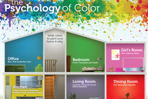
- Selecting Colors for Different Rooms
- Bedroom Colors
- Living Room Colors
- Popular Color Schemes
- Monochromatic Palette
- Complementary Colors
- Working with Neutrals
- Incorporating Whites and Beiges
- Adding Depth with Greys and Blacks
- Blue: Trust and serenity
- Yellow: Happiness and optimism
- Green: Balance and nature
- Red: Passion and energy
These insights into color psychology help in selecting the right shades for different spaces.
Importance of Choosing the Right Palette
Choosing the right color palette goes beyond mere preference; it plays a pivotal role in creating an environment that reflects personal style and enhances well-being. The right colors can boost productivity, improve mood, and even affect sleep quality. For example:
- In the bedroom: Soft pastels or neutral tones can promote relaxation and restful sleep, while bold colors might keep one awake.
- In the workspace: Utilizing energizing colors like green or blue can enhance focus and creativity.
When redesigning or decorating spaces, understanding color psychology ensures that the selected palette resonates with the intended vibe, ultimately creating a harmonious atmosphere that everyone can appreciate.
Basics of Color Theory
Primary, Secondary, and Tertiary Colors
Understanding the basics of color theory is essential for anyone looking to create a visually pleasing environment or artwork. At its core, color theory is built on three main categories: primary, secondary, and tertiary colors.
- Primary Colors: These are the building blocks of all other colors and cannot be created by mixing other colors. The primary colors are red, blue, and yellow.
- Secondary Colors: When you mix two primary colors, you get secondary colors. For instance:
- Red + Blue = Purple
- Blue + Yellow = Green
- Yellow + Red = Orange
- Tertiary Colors: These are made by mixing a primary color with a secondary color, resulting in hues like red-orange or blue-green.
Understanding these relationships can allow designers to develop a more nuanced approach to color selection.
Warm vs. Cool Colors
Now that you’ve grasped the basics, let’s dive into the emotional and visual impact of warm and cool colors.
- Warm Colors: Comprising reds, oranges, and yellows, warm colors tend to evoke feelings of warmth and energy. Think of a cozy autumn scene with vibrant orange leaves or a sunny beach painted in bold yellow. These colors are often associated with excitement and can make spaces feel more inviting.
- Cool Colors: On the other hand, cool colors such as blues, greens, and purples are calming and serene. A room adorned with soft blue can create a peaceful atmosphere, reminiscent of a tranquil lake. Cool colors are often used in spaces where relaxation is key, like bedrooms or spa-like bathrooms.
Bringing this knowledge into your design or decorating projects can elevate the ambiance of your spaces while aligning them with the feelings you wish to evoke. Choosing between warm and cool hues is an exciting opportunity to express mood and personal style.
Impact of Colors on Mood
Calming Colors
As we navigate the fascinating landscape of color theory, it becomes clear that color can significantly influence our mood and emotions. Calming colors play a pivotal role in creating a tranquil environment. Soft shades of blues, greens, and pastels have long been recognized for their soothing effects. Imagine walking into a serene room painted in a pale blue; the very atmosphere invites relaxation and calmness, akin to a clear sky on a sunny day. Here are some calming colors and their impacts:
- Blue: Known for its ability to lower heart rates and reduce stress, blue can be perfect for bedrooms or meditation spaces.
- Green: This color represents nature and balance, often promoting feelings of renewal and tranquility.
- Lavender: A gentle mix of purple and white, lavender is often used in spaces intended for relaxation, as it helps ease anxiety and sets a peaceful mood.
Integrating these colors into your living space can foster a sense of calm and serenity, allowing for peaceful reflection and relaxation.
Energizing Colors
On the flip side, energizing colors are essential for invigorating a space. These are the hues that stimulate the senses and enhance productivity. Think about how an office space painted in bright yellows or oranges can spark creativity and enthusiasm. Here are some of the energizing colors that can transform the vibe:
- Yellow: Associated with happiness and optimism, yellow often brightens a room and can boost mood significantly.
- Red: This bold color is known to increase energy levels and instill motivation, making it great for areas meant for social interaction or high activity.
- Orange: A blend of red and yellow, orange combines the positivity of yellow with the stimulating energy of red, striking a balance between excitement and friendliness.
Incorporating these energizing colors in spaces like home offices or gyms can help create an atmosphere that fosters motivation and activity, making them not just appealing to the eye, but enriching to the soul.
Selecting Colors for Different Rooms
Bedroom Colors
When it comes to selecting colors for different rooms, creating the right atmosphere is key, especially in the bedroom—a sanctuary meant for relaxation and rest. The color palette of this space should evoke tranquility and comfort. For bedrooms, consider these calming options:
- Soft Blues: This color can create a peaceful ambiance reminiscent of a clear sky. Blue shades can help lower heart rates, promoting a soothing environment perfect for sleep.
- Pastel Greens: Echoing nature, green hues can cultivate feelings of balance and serenity. Light shades like mint or sage work well with natural light, creating an airy feel.
- Neutral Tones: Think of beige, taupe, or soft white. Neutrals provide a serene backdrop while allowing you to infuse personality through decorations and accessories.
Ultimately, the aim is to create a restorative space. Personal touches, like choosing a favorite accent color through bedding or wall art, can enhance the calming palette while maintaining a warm atmosphere.
Living Room Colors
Shifting focus to the living room, this space should foster warmth and social interaction. Here, colors can be a bit more vibrant and inviting. Consider these options for an energizing yet comfortable living room:
- Warm Earthy Tones: Shades like terracotta, ochre, or warm browns can create a welcoming environment, perfect for gathering.
- Bold Accents: Incorporating pops of colors such as deep red, royal blue, or rich yellow can liven up the space. These colors can be introduced through furniture, cushions, or artwork, drawing attention without overwhelming.
- Neutral Bases: Using neutrals like grey or beige as base colors allows for flexibility. They provide a perfect canvas for dynamic accents and can help balance out bold hues.
The living room is a reflection of personal style, so blending soothing colors with energizing accents creates an inviting space where family and friends can come together and create lasting memories. With thoughtful color choices, every room in the house can resonate with the desired mood and lifestyle.
Popular Color Schemes
Monochromatic Palette
Diving into popular color schemes opens a world of possibilities for interior design. One of the most classic and sophisticated options is the monochromatic palette. This approach involves using varying shades and tints of a single color, creating a harmonious and cohesive look. Choosing a monochromatic palette can be both striking and serene. For instance:
- Soft Grays: A living room adorned in different shades of gray can provide a sleek, modern aesthetic. By mixing charcoal, slate, and dove gray, the space can feel unified yet dynamic.
- Deep Blues: Using various blues, from navy to powder blue, can evoke a tranquil yet luxurious ambiance in a bedroom. The subtle variations can create depth without overwhelming the senses.
The beauty of a monochromatic palette lies in its versatility. It allows for the incorporation of textures and patterns. A soft velvet sofa in a darker hue, alongside lighter cushions in similar tones, can add layers without straying from the color scheme. This approach can make a room feel sophisticated and put together.
Complementary Colors
On the other hand, the complementary color scheme is all about creating bold contrasts and visual excitement. This involves selecting colors opposite each other on the color wheel, resulting in vibrant combinations that draw attention. For example:
- Blue and Orange: This dynamic duo can energize your living space. A deep navy wall paired with rich orange accents—think throw pillows or artwork—can create a lively and inviting environment.
- Purple and Yellow: The royal essence of purple combined with the brightness of yellow can add vibrancy to any room. A lavender bedroom with sunflower yellow details creates a cheerful, sunny vibe.
Implementing complementary colors can generate a playful atmosphere, ideal for social settings. It’s essential, however, to balance the intensity—consider using one color as the dominant shade while the other serves as an accent to prevent overwhelming the space. Both the monochromatic palette and complementary colors offer unique styles that can define the character of any room. Depending on personal taste and desired atmosphere, either choice can elevate the interior design to new heights.
Working with Neutrals
Incorporating Whites and Beiges
When exploring color schemes, working with neutrals can provide a foundation that allows other elements of your design to shine. Whites and beiges are particularly effective at creating airy and expansive spaces. Using whites can evoke a fresh and clean atmosphere, making it suitable for spaces like kitchens and bathrooms. Imagine stepping into a kitchen with crisp white cabinetry complemented by a chic marble countertop—this combination not only looks elegant but also feels inviting. Beiges, on the other hand, introduce warmth and coziness. They can soften a room’s feel while maintaining a neutral backdrop. For example, a living room dressed in beige walls can harmonize beautifully with warm-toned furniture, creating a space where family and friends naturally gravitate. Incorporating whites and beiges is also a fantastic way to experiment with textures. Think of a plush, beige sofa paired with white linen drapes or knitted throw blankets.
Adding Depth with Greys and Blacks
Transitioning to deeper neutrals like greys and blacks, these shades can add sophistication and depth to any room. Greys are incredibly versatile, creating a modern and chic aesthetic. A beautiful grey accent wall can serve as a perfect backdrop for colorful artwork or vibrant furniture, allowing these elements to pop without being overpowering. Black, while bold, can create a sense of luxury and drama when used thoughtfully. For instance, black furniture or fixtures can act as statement pieces in a room. Picture a sleek black dining table set against a light grey wall—it draws attention while still keeping the overall look grounded and elegant. Combining greys and blacks with lighter neutrals can create a balanced palette that feels contemporary yet inviting. By layering these colors, along with varying textures and materials, any space can achieve an inviting and polished finish. Overall, working with neutrals opens up numerous avenues for creativity in interior design, ensuring that any style, from minimalist to eclectic, flourishes beautifully.


