The Impact of Color: Choosing the Right Wall Art Decor for Your Room
Importance of Wall Art Decor
Wall art decor is more than just decoration; it is a powerful expression of personality and emotion that transforms a living space. Picture walking into a room adorned with vibrant paintings, intriguing photographs, or thought-provoking prints. The atmosphere changes immediately, inviting conversation and stirring inspiration. Wall art serves several essential functions in home design:
- The Impact of Color: Choosing the Right Wall Art Decor for Your Room
- Importance of Wall Art Decor
- Influence of Color Psychology
- Understanding Color Theory
- Warm vs. Cool Colors
- Complementary Color Schemes
- Choosing the Right Color Palette
- Harmonious Color Combinations
- Contrasting Color Options
- Impact of Colors on Mood
- Relaxing and Calming Tones
- Energizing and Vibrant Hues
- Incorporating Color in Different Rooms
- Bedroom Wall Art Decor
- Living Room Wall Art Decor
- Personal Expression: Art reflects who you are, your interests, and your experiences. Choosing the right pieces can provide guests with insights into your personality.
- Visual Focal Points: A well-placed piece can act as a focal point, drawing the eye and creating a sense of balance in a room. Utilizing large-scale art can make a statement while smaller pieces can add layers of interest.
- Enhancing Space: Wall art can create an illusion of space or warmth depending on the size, color, and style. It can turn blank walls into captivating canvases that engage the viewer.
In essence, wall art decor not only beautifies a space but also enhances the overall ambiance and feel of a home.
Influence of Color Psychology
Color psychology plays a crucial role in the impact of wall art decor. Different colors evoke varying emotions and set the tone of a space. For instance, warm colors like reds and oranges tend to stimulate energy and enthusiasm, making them suitable for social areas like living rooms or dining rooms. On the other hand, cool colors such as blues and greens promote tranquility and relaxation, crucial for spaces like bedrooms or meditation corners. To illustrate these effects, consider the following examples:
- Red: Energizing but can also denote strong emotions.
- Blue: Calming and is often found in serene settings.
- Yellow: Bright and cheerful, perfect for kitchens or playrooms.
Understanding the impact of color can help anyone make informed choices about their wall art, aligning the ambiance with the desired emotional outcomes. By thoughtfully selecting colors, one can elevate the mood of a room and enhance the overall living environment.
Understanding Color Theory
Warm vs. Cool Colors
Diving into the realm of color theory, it’s vital to recognize the distinction between warm and cool colors. Each category evokes different feelings and serves unique purposes in wall art decor. Warm Colors: These colors, including reds, oranges, and yellows, are reminiscent of warmth and energy. They often create a spirited, inviting atmosphere.
- Emotional Impact: Warm colors can stimulate excitement and foster feelings of enthusiasm. For example, a fiery red painting might be perfect in a dining room to encourage lively conversations during dinner parties.
- Best Uses: Consider using warm colors in spaces where interaction occurs, such as living rooms and kitchens. They can make large areas feel more intimate and inviting.
In contrast, Cool Colors: Shades like blue, green, and purple lend a serene vibe to any space. These colors remind one of nature—think clear skies and lush landscapes.
- Emotional Impact: Cool colors often promote calmness and relaxation. A soft blue artwork can transform a bedroom into a tranquil retreat, making it an ideal choice for restful spaces.
- Best Uses: Utilize cool colors in areas designed for relaxation, such as bedrooms, nurseries, or reading nooks, to create a peaceful atmosphere.
Complementary Color Schemes
Now, let’s explore complementary color schemes, a fundamental concept in color theory that can take wall art decor to the next level. Complementary colors are colors that are opposite each other on the color wheel, and when used together, they create a striking visual tension. For example:
- Red and Green: This iconic duo works beautifully in holiday-themed artwork but can also add interest to any space.
- Blue and Orange: A vibrant pairing that can energize a room.
Using complementary colors in wall art can achieve:
- Focus and Engagement: They can draw attention to a particular piece, making it a stunning focal point. A bright orange piece against a cool blue wall instantly captures the eye.
- Balance and Harmony: Combining these colors can also create a sense of balance in a room, as they enhance each other’s vibrancy when placed together.
Through this understanding of warm vs. cool colors and complementary schemes, choosing wall art decor becomes an exciting adventure that allows for rich emotional expression and stunning aesthetics.
Choosing the Right Color Palette
Harmonious Color Combinations
Building upon the foundations of color theory, selecting the right color palette can truly elevate wall art decor. One effective approach is to create harmonious color combinations, which are made up of colors that blend well together, resulting in a soothing and visually pleasing ambiance. Harmonious colors are typically found adjacent to each other on the color wheel. For instance:
- Analogous Colors: Using shades like blue, teal, and green can evoke a serene coastal theme, perfect for a calming space like a spa-inspired bathroom.
- Monochromatic Schemes: Sticking to varying shades of one color, such as dark green to light mint, can create a sophisticated, cohesive look.
To choose harmonious colors, consider these tips:
- Limit Your Palette: Aim for three to five colors to keep the decor cohesive and avoid overwhelming the senses.
- Play with Textures: Incorporating different textures can add depth even within a harmonious color scheme. A glossy blue canvas alongside a matte teal print can keep the visual interest high.
I remember when my friend redecorated her living room. She chose a palette of soft greens and creams, which made her space feel inviting and serene. The art pieces she selected in these shades became a perfect complement, allowing for a tranquil yet engaging environment.
Contrasting Color Options
On the flip side, exploring contrasting color options can inject energy and excitement into a room. Contrasting colors, which sit opposite each other on the color wheel, create a vibrant dynamic that can make wall art decor pop. Here’s how to effectively use contrasting colors:
- Create Focal Points: A bright yellow painting on a deep purple wall can serve as a striking conversation starter.
- Balance with Neutrals: If using bold contrasting colors, balance them with neutral tones like beige or grey to prevent visual overload.
Consider the powerful impact of a contrasting palette. For example, in a child’s playroom, combining bright blue and sunny orange can stimulate creativity while keeping the environment lively. Some key points to remember when utilizing contrasting options:
- Use Sparingly: Too many contrasting colors can lead to chaos; focus on one or two pairs for maximum impact.
- Incorporate Various Dimensions: Mixing art styles within those contrasting colors can add instant character without overwhelming the viewer.
By carefully choosing between harmonious or contrasting color palettes, individuals can curate wall art decor that resonates with their personal style and the mood they wish to create in their homes. Each choice contributes to the overarching narrative of the space, ensuring it remains inviting and engaging.
Impact of Colors on Mood
Relaxing and Calming Tones
As we delve deeper into the impact of colors on mood, it becomes clear that our choices can significantly influence how a space feels and functions. Relaxing and calming tones are particularly effective in creating environments conducive to rest and reflection. Cool colors—such as soft blues, gentle greens, and earthy browns—are known to evoke tranquility and promote a sense of peace. These colors work wonders in spaces intended for relaxation, like bedrooms and meditation areas. Consider these benefits of incorporating calming tones into wall art decor:
- Stress Reduction: Soft hues like light aqua or pastel lavender can lower anxiety levels, making a room feel safe and serene.
- Enhanced Focus: Gentle greens can enhance concentration, making them ideal for home offices or study areas.
I recall visiting a friend’s home who had transformed her bedroom into a serene sanctuary using calming tones of green and soft beige through various paintings. The room instantly felt inviting and peaceful, perfect for unwinding after a long day. To effectively integrate calming colors in your decor, consider:
- Textures: Use textiles in the same calming shades—think plush throws or soft bed linens—to create a unified look.
- Nature-Inspired Art: Incorporate artworks that showcase nature, such as landscapes or serene water scenes, which can further enhance feelings of tranquility.
Energizing and Vibrant Hues
On the opposite end of the color spectrum are energizing and vibrant hues that invigorate and stimulate the senses. Colors like bright yellows, fiery reds, and lively oranges can breathe life into a space and motivate its occupants. These energetic colors shine in environments where social interaction and creativity flourish. Here’s how they impact mood:
- Increased Energy Levels: Bright colors can elevate energy and mood, making them perfect for family rooms or studios.
- Creativity Boost: Vibrant shades can inspire and spark imagination, making them excellent for artistic spaces or children’s rooms.
For instance, when I revamped my home office, I decided to hang a colorful abstract painting that had splashes of orange and yellow. The piece electrified the room and transformed my workspace into a hub of creativity. It also gave me that much-needed boost of energy during long working hours. To incorporate energizing hues effectively, consider:
- Accent Walls: Use vibrant colors on a single wall to create a focal point without overwhelming the space.
- Mix with Neutrals: Pairing these bold colors with neutral elements can help balance the visual intensity while keeping the lively spirit.
By understanding the impact of relaxing and energizing colors, individuals can create wall art decor that not only beautifies their space but also supports their desired mood and function. Each color choice becomes a powerful tool in shaping the overall atmosphere of one’s home.
Incorporating Color in Different Rooms
Bedroom Wall Art Decor
Transitioning from the understanding of color’s impact on mood, let’s explore how to effectively incorporate color in different rooms, beginning with the bedroom. This space serves as your personal sanctuary and should evoke feelings of comfort and tranquility. When selecting wall art for the bedroom, consider these tips:
- Choose Calming Colors: Opt for shades such as soft blues, greens, or muted pastels which can help create a restful environment. Artwork featuring serene landscapes or abstract designs in these tones can enhance the calming atmosphere.
- Incorporate Personal Touches: Artwork that reflects personal experiences—like photographs from memorable trips or prints of favorite quotes—can instill a sense of peace and happiness.
For example, a friend of mine created a gallery wall in her bedroom using various calming green tones and personal photos from her travels. This not only made the room feel more inviting but also added a unique, personal touch that brought her joy every time she entered.
- Layer your Art: Combine different frame styles and art sizes to add depth. A large piece above the headboard can anchor the room, while smaller framed prints can fill out other areas.
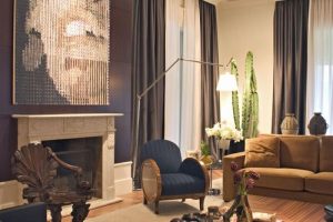
Living Room Wall Art Decor
When it comes to the living room, the approach to wall art decor can shift. This is typically the hub of social gatherings, where energy and liveliness are important. Here are some strategies for selecting the perfect pieces:
- Incorporate Vibrant Hues: Bold colors like reds, oranges, and yellows can inject energy into the space. A large painting with dynamic colors can serve as a focal point and spark conversation.
- Showcase Variety: Opt for a mix of art styles—abstract, modern, and even classic pieces—to create visual interest. This variety can turn your living room into a gallery of creativity.
I remember attending a housewarming party at a friend’s stylish living room that featured an eye-catching abstract painting in striking reds and yellows. The energy the artwork exuded perfectly matched the vibrant conversations and laughter that filled the room.
- Utilize Frames: Select frames that complement your furniture and decor style. For a modern look, consider sleek and minimalistic frames; for a more eclectic vibe, mix and match frames in various finishes.
By thoughtfully choosing wall art decor for both the bedroom and living room, individuals can create dynamic environments that reflect their personalities and promote desired feelings. Incorporating color effectively allows each room to fulfill its purpose, whether it’s offering a retreat for relaxation or a vibrant space for social interaction.


